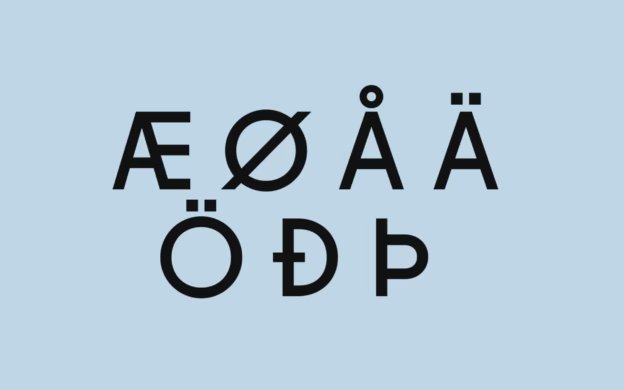
I know, writing an article about Scandinavian fonts is height of design nerdery, but here we are. As much as I try to pretend that I don’t drool over a nice slab serif, it’s time to face facts: I am one of those people. I really love typography. “More than life” is the somewhat concerning evaluation of my sister when I asked her if I actually did love typographical design quite that much.
Typography was something that I noticed from a young age. My first love was Dom Casual when it eased my way through my first poetry recital. The labels on my school books were the height of avant-guarde cool thanks to Wingdings 3.0. Soon afterwards, I joyfully upgraded from Office 95 fonts to the seemingly endless possibilities of Office 97. As much as I like Matisse ITC, I didn’t want my teachers to think I was an anarchist. These were exciting times for an 11-year-old.
As I grew up, the font patterns emerged. Frutiger is used in almost every airport. Indian restaurant menus favor Trajan Pro. Across Denmark, hairdressers and locksmiths have mysteriously united under the same banner: white Broadway on a black background. And now, Brandon Grotesque, the crowd-pleaser of the moment, is having its moment in the sun.
Fonts are a way to personify our words, giving even the most mundane text a layer of visual meaning. There is a personality in every typeface. Consequently, there are certain fonts that capture the Scandinavian personality: clean, functional, beautiful, with just a dash of quirkiness. But alas, not all fonts embrace the Scandi alphabet with its å, æ and ø possibilities (I’m looking at you Governor). The ones that do, and that also feel at home in Nordic design, deserve a mention.
Here are my top picks of fonts for the Scandinavian alphabet:
 Avenir
Very simple. Very Scandi.

| Shop |
Avenir |
Fonts similar to Avenir
 Caslon
This typeface looks both incredibly modern but also classic. No, it doesn’t originate in Scandianvia, but it has certainly be favoured in older editions by Gydendal Publishing.
If you’re looking for a classic font that’s similar to Times New Roman with an edge, Caslon is you’re best bet. The typeface has been around since the late 1600s, and will be likely to hang around for years to come. Long live Caslon!

| Shop |
Caslon |
Caslon was used in the famous edition of Byrne’s Euclid, published by William Pickering in 1847:

 Elephant
Move over Futura, this font is my new standard sans serif. I discovered it when learning about Bouvetøya, a remote Norwegian Island in the middle of the Atlantic Ocean.
If you’re into graphics and strange remote islands, the Bouvetoya: A Cultural History of an Isolated Landmass book is not only a beautiful book, it’s a fascinating read.

| Shop |
Elephant |
 Fugue
Fugue
This is probably the sexiest font in town. When we met, I texted a friend that I was in love. No irony, just full devotion. I finally purchased the font as the 30th birthday present for myself. I don’t know why I’m telling you these embarrassing details about myself. Unfortunately the “I” leans too hard towards a serif font, and the “J” leans to hard towards nothing, but what’s love without a few aesthetic compromises?

| Shop |
Fugue |
 Inter
Inter
An elegant font created by Rasmus Andersson, a Swedish designer and programmer based in San Fransisco. Designed for screens, the font is highly readable and, I guess, cool. Best of all, Inter is a free and open source font family, so you’re free to use it in almost any way imaginable!

| Shop |
Inter |
Other Fonts We Use on This Website
Generally on Scandinavia Standard, our go-to font for headings is Plantin, but otherwise we use Adobe Caslon, and Futura for small headings.
Occasionally, we use Fugue for graphical elements. And in case you’re interested, the Scandinavia Standard logo is based on Austin, with customised letters.
Curious about Scandinavian design? Discover more!
Heads up! This article contains affiliate links. For more information on affiliates, please see our Disclosure Policy.

