| In partnership with |
Scandinavian design and monochrome are often uttered in a single breath: it seems that Scandinavia’s certain brand of minimalism has come to be synonymous with a strict color palette of black and white.
From the outside, this might seem like the easiest choice for design. Mark Francis, a wealthy socialite known for his sharp tongue and sharper suits, once quipped that “black & white is best for the sartorially challenged.” A comment on Scandinavia? Perhaps. But as we’ve come to learn, getting black and white right is anything but easy.
There are multiple things to consider; for a start, there isn’t just one white and one black – there’s a myriad of shades and tones that can take a simple black from cloudy and faded to so intensely deep it swallows light. Color also continues to evolve with use; whites can yellow and black can fade over time.

Alongside the physical conditions of color are the metaphysical conditions. How we perceive and define color, and how we view that color in connection to the rest of the world. Take the infamous black and blue dress, or was it white and gold? The way colors interact with one another and how we perceive them shifts continuously. There can be no one white and one black because there is no one way to see them.
Now imagine working with such a volatile shapeshifter that insists on changing every time it’s applied to something new. That’s exactly what the color and material experts at Sonos, a US-based manufacturer of wireless home audio products (but they’re oh so Scandi to look at), do in their quest for the perfect shade of white and black.
The team is headed up by Kitty Suidman, the Design Director of Color, Material, Finish (CMF) and Product Sustainability at Sonos. She’s tasked with the seemingly simple job of making things black and white.
 |
 |
Upon starting at Sonos in 2013, Suidman pushed for the company to deliver on “calm technology.” This design philosophy focuses on the interaction between technology and its user, and is designed to occur in the user’s periphery rather than constantly at the center of attention. “We refer to it as delivering against a monolithic design,” explains Suidman. “I want to make sure that our products simply feel calm in the home.”
To do this, “we made the strategic choice to make everything all white and all black. But this makes it a lot harder to actually manufacture,” explains Suidman. “You’re dealing with a lot of different materials that sit next to each other and all those parts have to match so that the outcome looks very clean and simple, while making sure that it works with the rest of the Sonos system.”

As an example, Sonos Move, a powerful portable speaker with Wifi and Bluetooth connections, is comprised of 20 different parts that are different materials – and they all have to match. To do this, Suidman develops recipes which her team then continues to develop across different materials – metal, plastic, silicone, etc. They develop a “golden sample” which is the right color across the board, then limit samples which set the range in which a color must fall into to be used.
“There are plenty of different things that can influence color,” she expands. “Like texture or gloss level.”
“If you think about paint; a low gloss versus a high gloss can really affect the color. If you take a color like black and put a really low gloss finish on top of that, it reads a lot less deep and it becomes milkier, versus a really high gloss which gives you much more depth.”
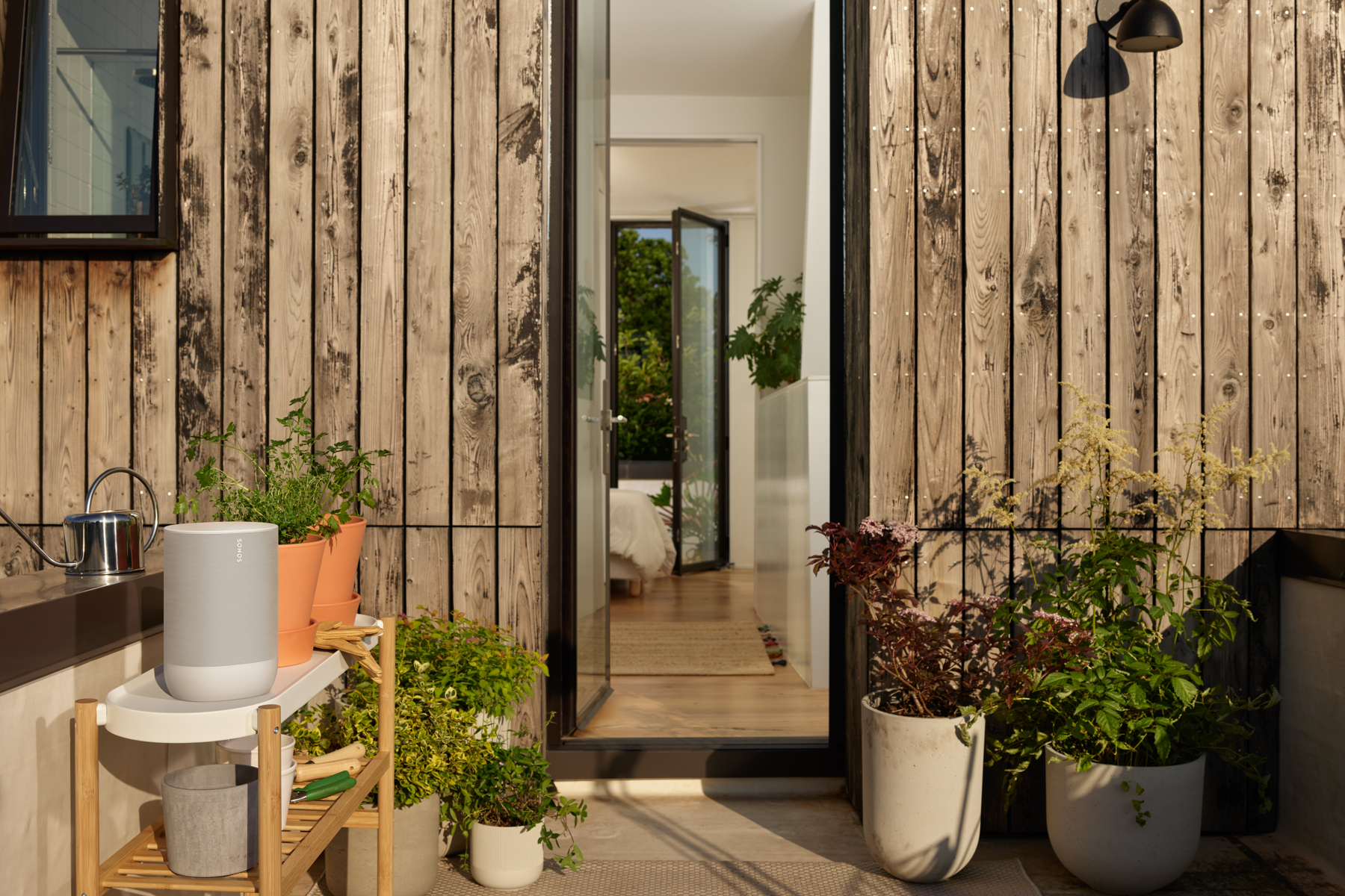
But the biggest influence when working with color comes from human perception. The way we physically perceive color played a huge role in finding the right shade for the Sonos Move. “We actually took a range of colors and tested them in an outdoor environment. The Sonos Move’s Lunar White is a color that was developed specifically with the outdoors in mind, because Sonos White felt too bright and too harsh.”

But beyond this, there is our automatic association with color that influences our decision making. “Black has always been a color that has been around in the audio space, so it’s always been a color that’s been relevant in home speaker design,” explains Suidman.
“But black is a very difficult color to use outdoors because it can overheat really quickly. We tested a product in black in an outdoor environment and it shut it down really quickly.” So white then? “White actually worked outside, but white is also a color that is perceived as getting dirty quickly and yellowing in the sun.”
Of course, after Sonos’s outdoor testing, they were able to find a dark and light shade, Shadow Black and Lunar White, that wouldn’t overheat or get grubby, and thanks to 600 hours of testing in a UV chamber, they can guarantee no yellowing.
This testing and strategic color choice is also a part of a sustainability effort. By ensuring timeless design in enduring colors with a high quality, a Sonos product will stay in your home (or garden) for longer.
“These colors are long-lasting and not super trend sensitive,” elaborates Suidman. “If you think about Shadow Black or Lunar White, they’re still very neutral colors. There’s longevity around color choice, but there’s also this longevity around durability and making sure that from a technical perspective these products last a long time.”
So, black and white might not be so simple, but it’s definitely the smart choice.
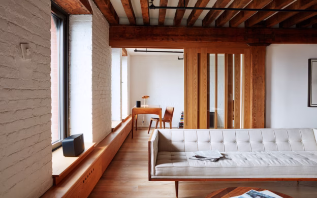
Check out Sonos Move in the home with our tour of Sophia and Billy’s Vesterbro apartment.

Above: Sonos Kitty Suidman, Sonos Director of Colors & Materials
Find out more Sonos here.