I’ve sat in a lot of hotel rooms.
One carry-on, same morning routine in every city, gym access ranked above thread count. Over the years, I’ve watched interior design trends move through lobbies, cafés, and short-term rentals like software updates — each one arriving quietly, spreading fast, and eventually becoming invisible through repetition. None of them moved as quickly, or stayed as long, as the Scandinavian aesthetic. And none of them has been copied more badly.
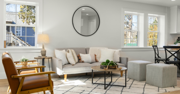
You’ve seen the copies. Bare white walls with a single framed print. A low-profile sofa in oatmeal linen. A wooden side table with three carefully arranged objects on it. A pendant lamp that looks expensive but somehow doesn’t feel like anything. It’s clean. It’s inoffensive. It photographs well. And it has almost nothing to do with what Scandinavian design actually is.
First, how it spread
Scandinavian design didn’t go global because of Instagram, even though Instagram accelerated it. It spread because it solved a real problem. Post-war Europe needed affordable, functional objects that could be produced at scale without looking utilitarian. Designers in Denmark, Sweden, Norway, and Finland — working under the cultural pressure of long winters, small living spaces, and a deep social value placed on equality — created things that were simultaneously beautiful and useful. Not decorative. Not status-signaling. Useful.
Arne Jacobsen’s chairs. Alvar Aalto’s furniture. Hans Wegner’s Wishbone chair. These weren’t minimal for the sake of minimalism. They were stripped of excess because excess was the problem. The lines were clean because clean lines were honest. The materials were natural because natural materials aged well and connected the indoor space to the outdoor world that Scandinavians revere despite — or because of — its harshness.
What Pinterest and Instagram captured was the surface: the palette, the silhouette, the negative space. What they couldn’t photograph was the philosophy underneath.
The one thing most people miss
I’ve spent years working with high-performers who confuse the signal for the system. People who copy the behaviors of effective colleagues — the early starts, the neat desks, the calm emails — without understanding what generates those behaviors in the first place. The aesthetic looks the same. The results don’t follow.
Scandinavian design has the same problem at scale.
The thing people miss is intention. Specifically: the Scandinavian concept of having fewer things that you actually love, rather than fewer things that simply look like fewer things. There’s a difference between a room with nothing in it and a room that contains only what matters. One is empty. The other is chosen.
In Denmark, there’s hygge — the untranslatable quality of warmth, coziness, and belonging that good design is supposed to support. In Sweden, there’s lagom — the principle of “just the right amount,” not too much, not too little. In Finland, there’s a related cultural emphasis on sisu, a kind of quiet resilience that doesn’t perform. These aren’t aesthetic values. They’re behavioral ones. The design follows from them.
When you strip those values out and keep only the look, you get the copy. Clean but hollow. Minimal but not meaningful. The room feels like a staging for a life rather than a space that holds one.
Why the copy is so convincing
I keep a mental list of things that look like one thing but function as another. “Getting ready to work” is actually avoidance. “I’m just being thorough” is often fear. “I need more information” is sometimes a stall. The Scandinavian copy lives in the same category. It looks like simplicity. It functions as performance.
And the reason it’s so convincing is that the original is genuinely hard to fake at the surface level. The palette — whites, warm grays, muted greens, natural wood — is correct. The furniture shapes — low, clean, structural — are right. The materials — wool, oak, ceramic, linen — check out. So the copy looks plausible even when the spirit is entirely absent. You can walk into a room styled to look Scandinavian and feel nothing, and not know why.
The why is that the original was designed to make you feel something specific: settled, present, unbothered by visual noise. A well-designed Scandinavian room reduces the low-level cognitive load of a cluttered environment. It doesn’t just look calm. It produces calm. The copy looks calm and then asks you to generate the calm yourself, which is not how any of this works.
What actually makes it work
I keep my home uncluttered. Not because I’m performing minimalism or running a design aesthetic, but because clutter spikes my stress in a way that has nothing to do with how the space looks in a photo. I can feel it before I’ve consciously registered it. The mess creates friction. Friction creates low-level resistance. Resistance becomes avoidance. I’ve tracked this in myself long enough to know it’s real.
That’s closer to what Scandinavian design actually understood: your environment is a behavioral system. What surrounds you shapes what you do, how you feel, and how clearly you think. The Scandinavians didn’t design minimal spaces because they liked the look of emptiness. They designed environments that actively supported a certain quality of life — rest, connection, focus, warmth in the long dark months — and then removed everything that didn’t contribute to those things.
The question that makes the original work is not “what should I add?” It’s “what is this space actually for, and what gets in the way of that?” Every choice follows from the answer. The copy skips the question entirely and starts with the Pinterest board.
The deeper thing it’s pointing at
I’m not a design writer. I write about behavior — why people don’t do what they intend to, why smart people underperform, why the gap between knowing and doing is almost always emotional rather than informational. But design is behavior. The way you arrange your environment is a series of decisions that either support or undermine how you actually want to live.
Scandinavian design became the world’s most copied aesthetic because it identified something real: that most people are living in spaces that work against them, full of objects that don’t serve them, generating low-level noise that compounds over time. The movement toward simpler, more intentional spaces was a genuine response to a genuine problem.
The copy spread because the aesthetic is beautiful and accessible and easy to assemble from a flat-pack warehouse. But beauty and accessibility are not the same as function. A room that looks calm is not the same as a room that creates calm. A chair that looks considered is not the same as one that was considered.
The one thing most people copying Scandinavian design are missing is the same thing most people miss when they copy any effective system: the reasoning behind the decisions. The surface is reproducible. The thinking isn’t — unless you do it yourself.
How to actually use it
The practical version of this is not complicated, though it requires the kind of honest audit that most people defer indefinitely. Walk through your space and ask a single question about everything in it: does this make the room better at what it’s for? Not “do I like it” or “did it cost money” or “does it look good in isolation.” Does it make the room better at its actual function?
A bedroom is for sleep and recovery. A living room is for rest, conversation, or focus, depending on how you use it. A kitchen is for preparing food. If an object doesn’t serve that function, it’s friction. It might be beautiful friction. It might be sentimental friction. But it’s still friction, and Scandinavian design — at its actual origin, not its Instagram iteration — was a sustained argument that friction has a cost.
Remove the friction. Keep what remains. Stop calling it minimalism and start calling it what it is: a space that’s been designed around how you actually live, rather than how you imagine a well-designed life should look.
That’s what makes it work. That’s what the copy misses. And honestly, it has nothing to do with the lamp.