What are the most popular Scandinavian colors? Are they mostly white, black, and tones of grey? If your only experience of Scandinavian design is the well-known Nordic minimalism, you’d be forgiven for thinking that the range of colors in this design world are limited.
British paint brand Farrow & Ball set out to prove that there’s more to the Nordic color palette than greyscale. Their “Nordic Edit” is chosen from the brands 132 colors, with a special focus colors that correspond to the Nordic landscape and city architecture facades.
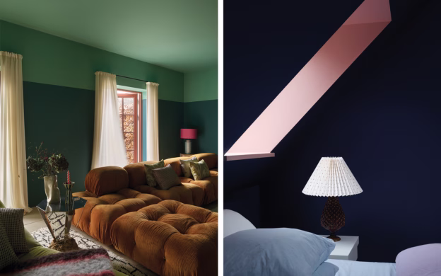
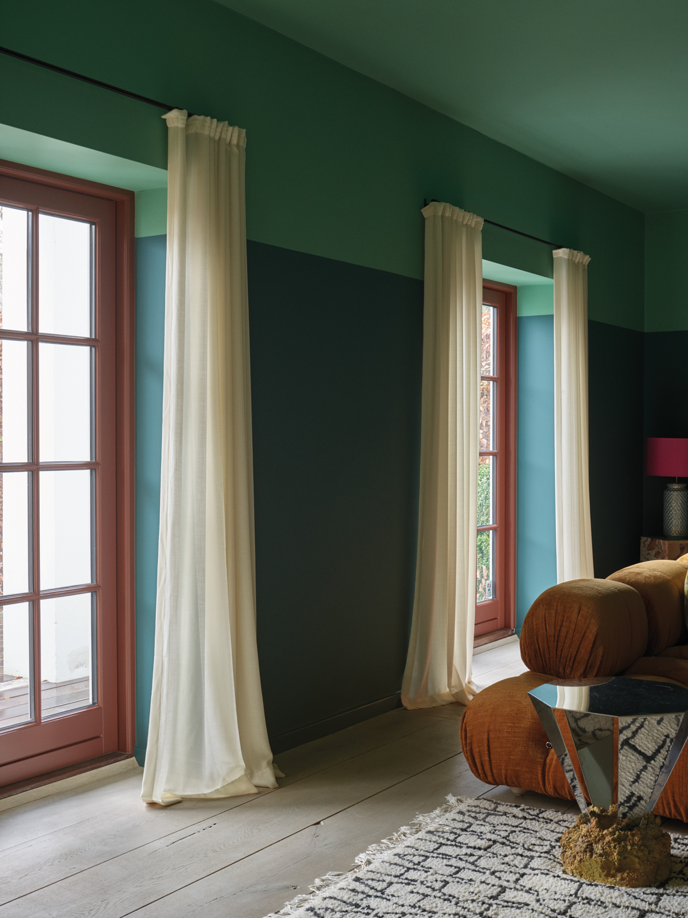
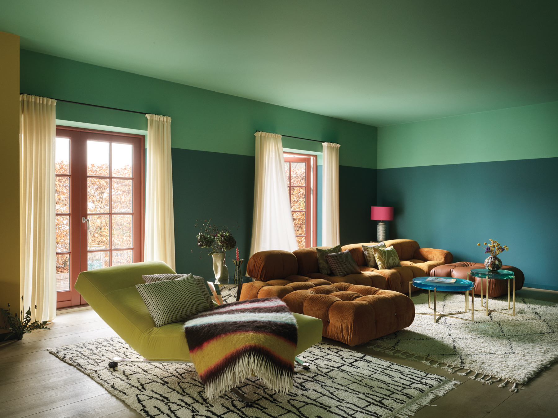
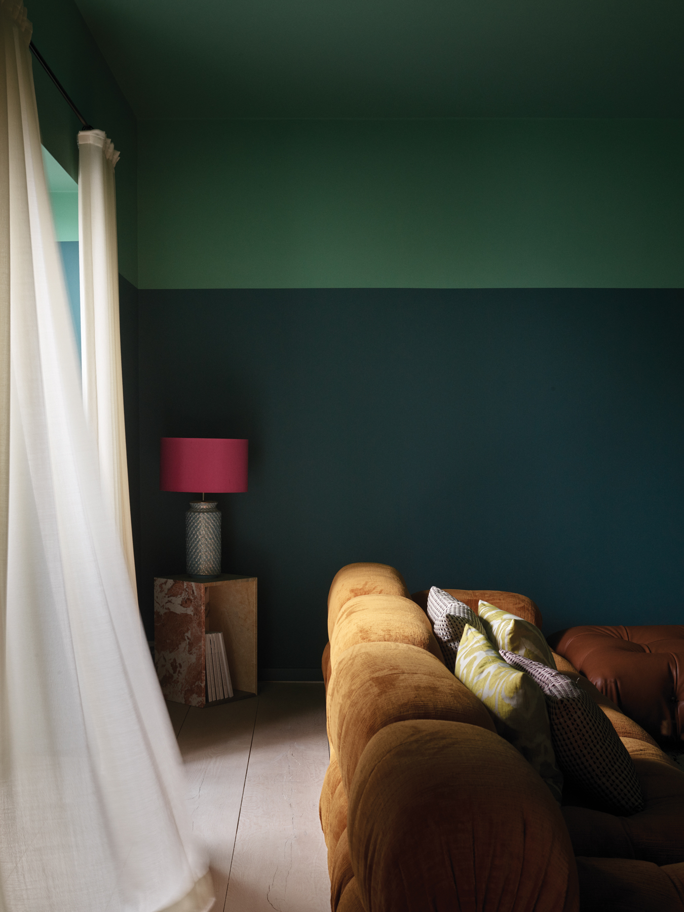
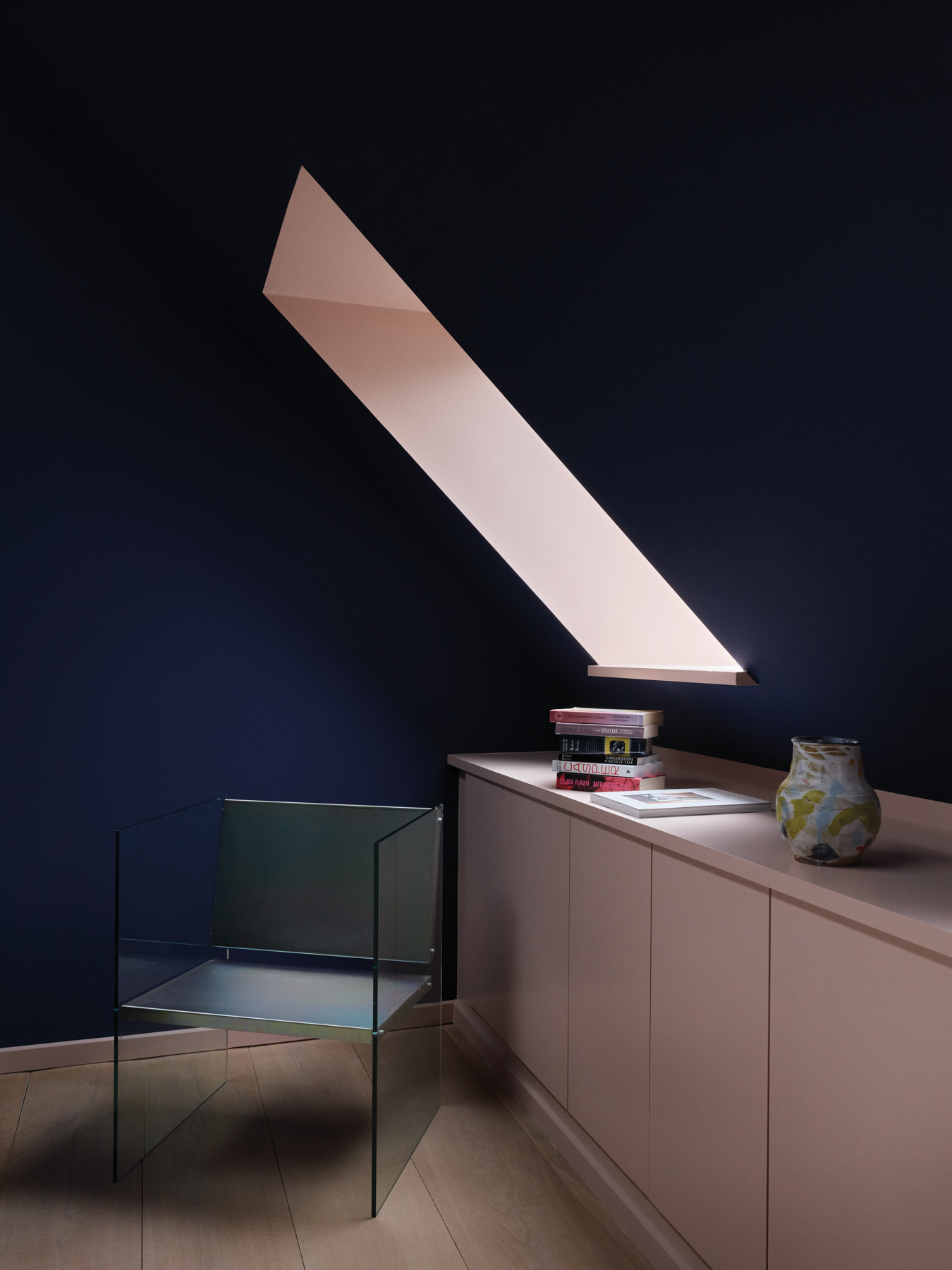
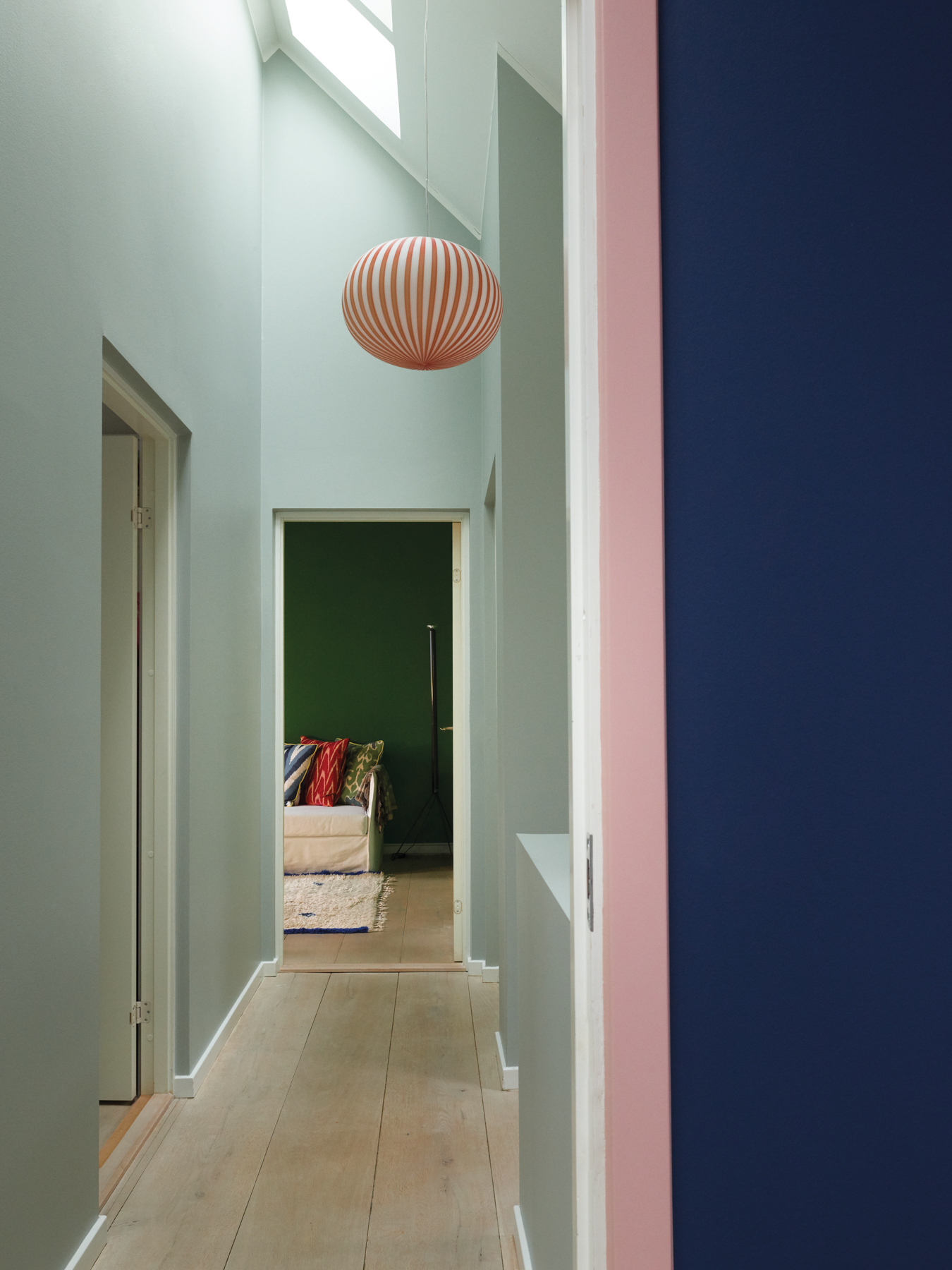
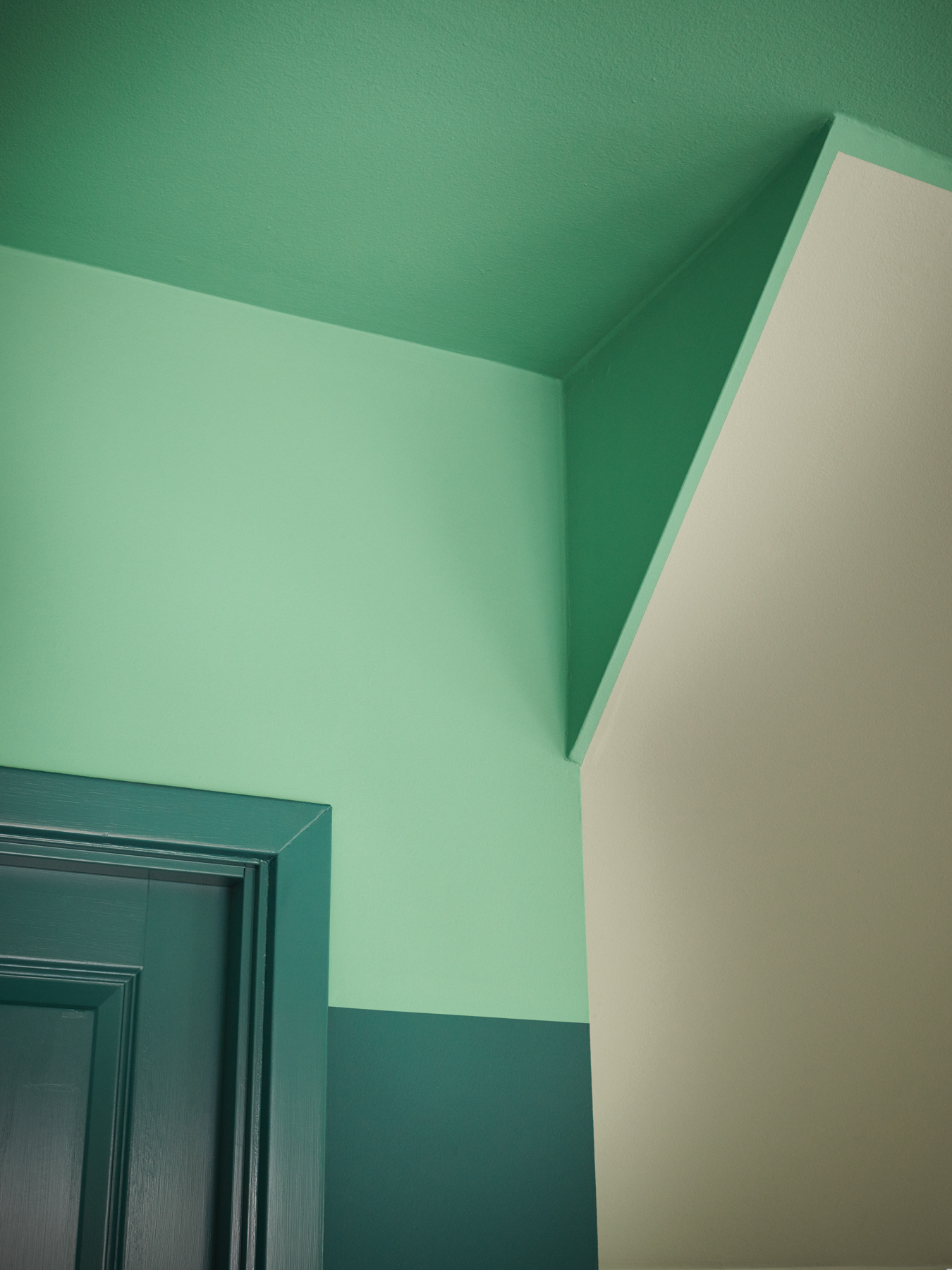
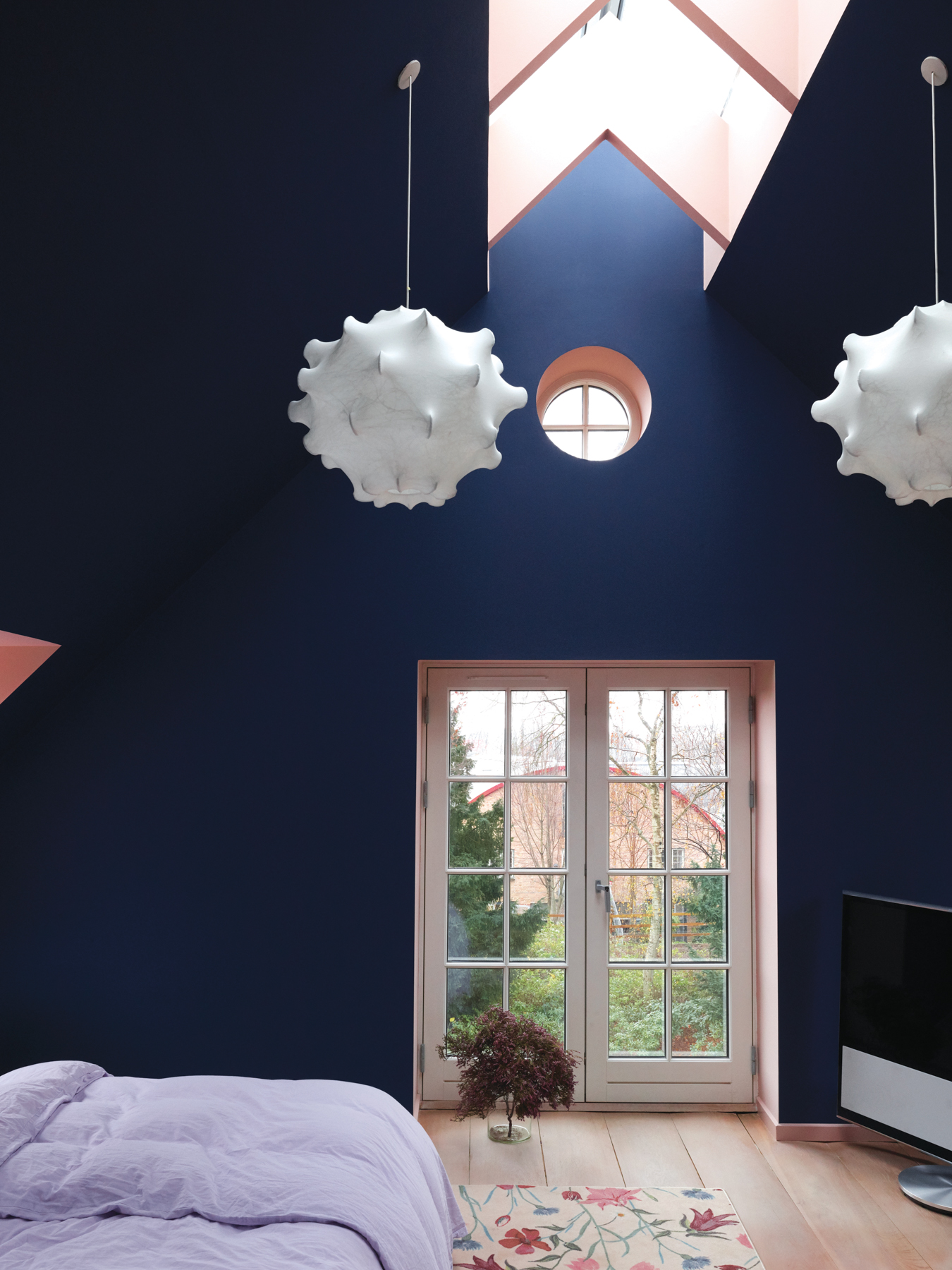
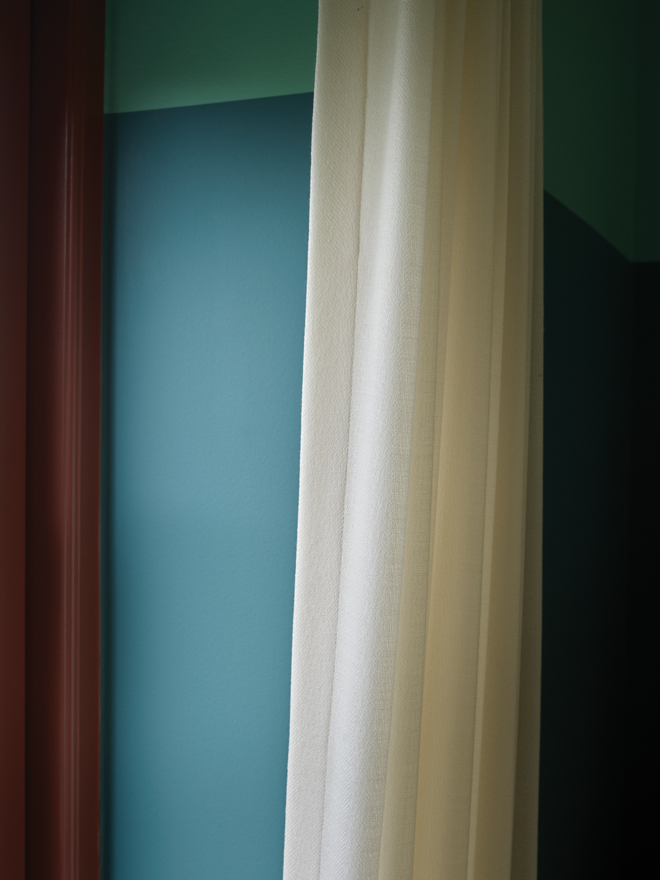
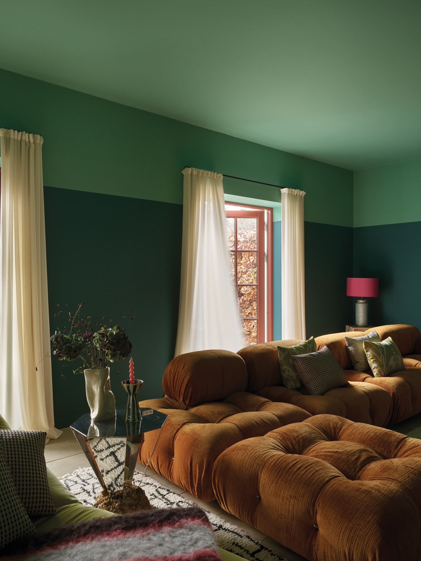
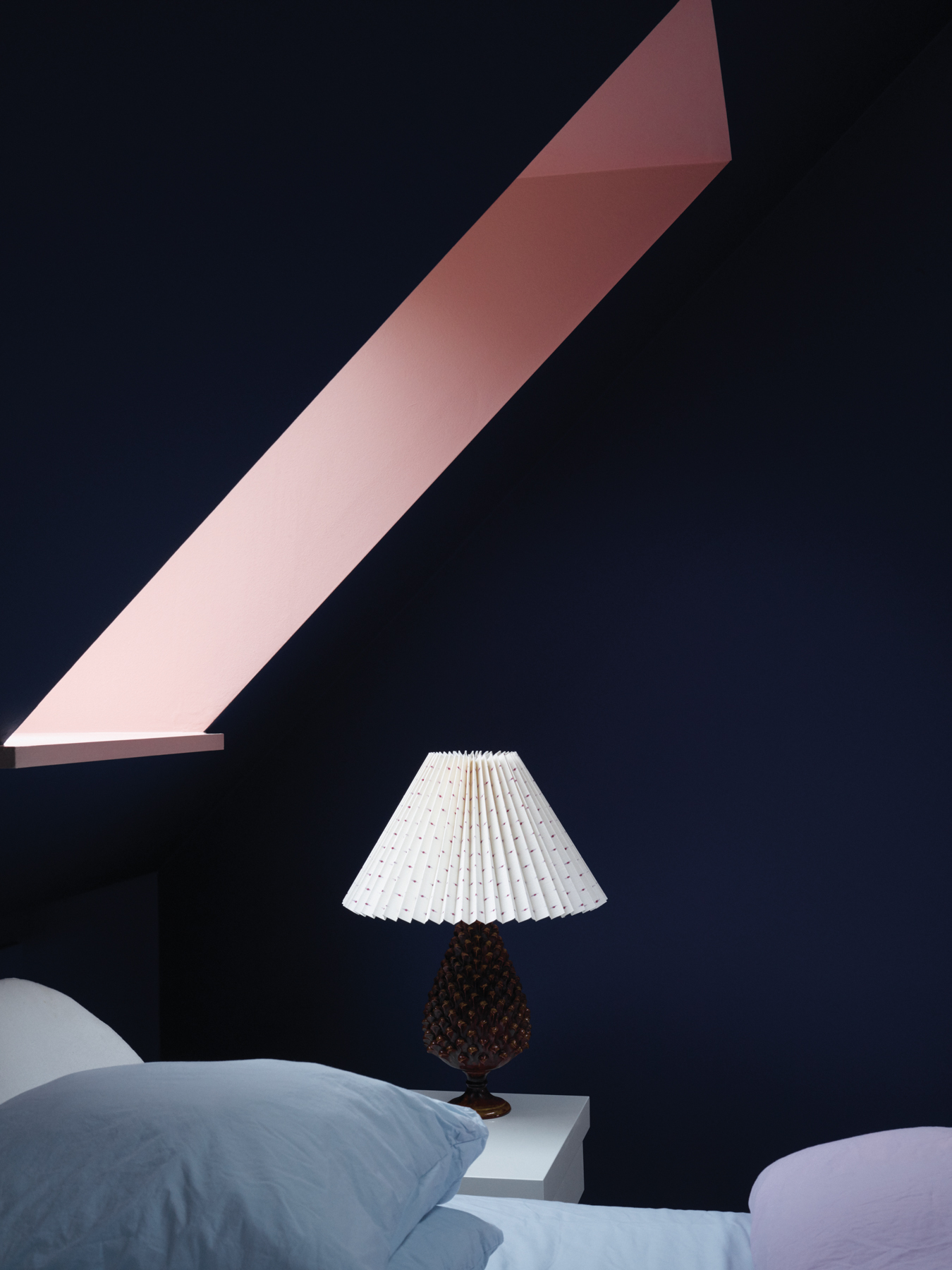
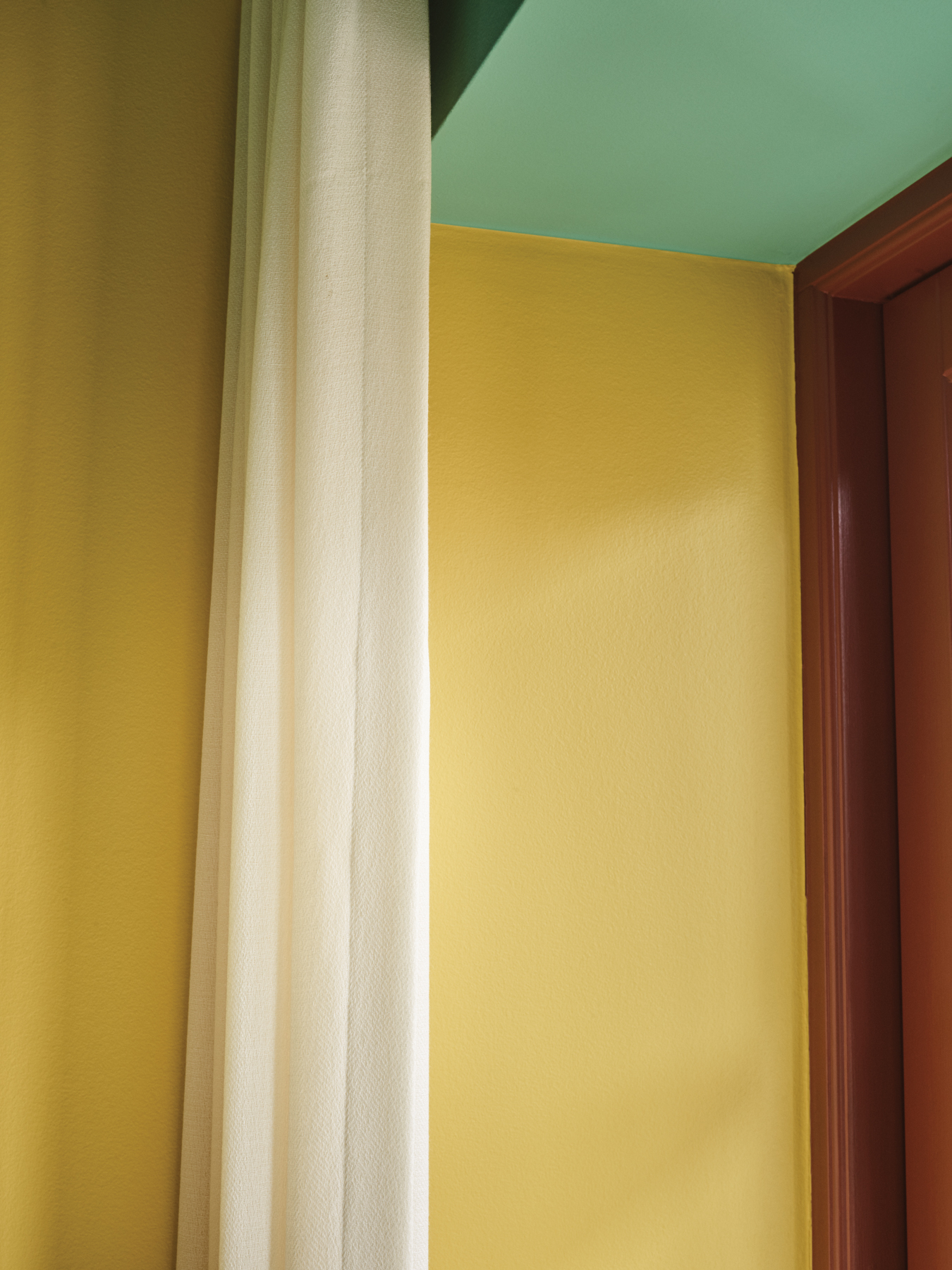
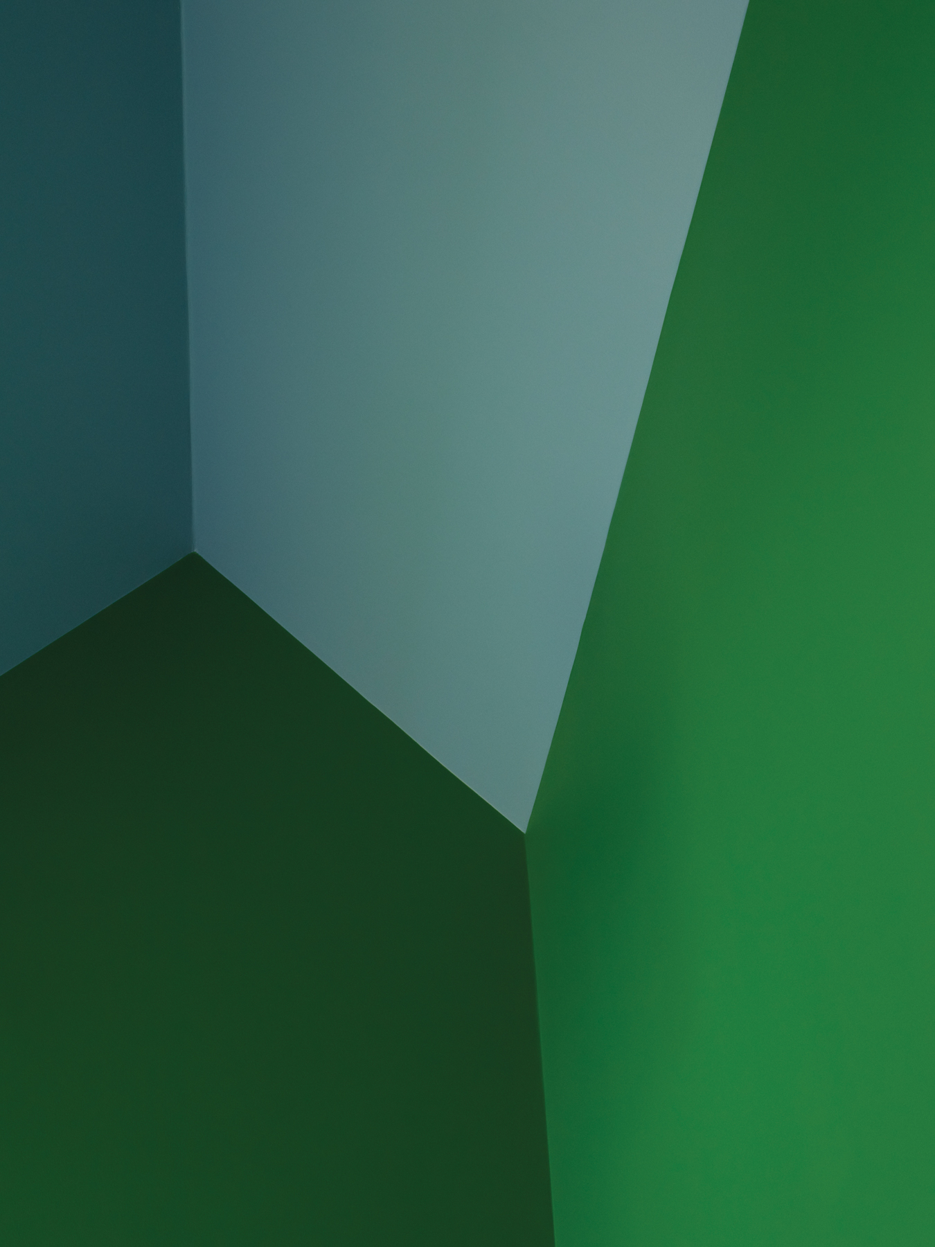
To showcase how these colors can be used in conjunction with art and Scandinavian design, the home of Danish art collector Sara Lysgaard was painted with the chosen palette. The results are ethereal; it is clear that space and light play a major part in how we experience colors inside the home.
We spoke with Jannik Martensen-Larsen, owner of Tapet-Cafe and developer of the Nordic Edit for Farrow & Ball, about the misconceptions of color in Scandinavia and how to use strong paint colors in the home. Plus, take a peek inside Sara Lysgaard’s colorful house:
Can you tell us a bit about this project and how you became involved in it?
I have dreamed of pinpointing special and modern colors for many years. I have loved working with colors from the Farrow & Ball archive and I felt that there is so much gain from exploring this hidden selection. With a modern take and the influence of Scandinavian architecture and design, I really wanted to show our market the endless possibilities you can get when using Farrow & Ball paint colors.
I have curated an edit of colors that can be used in both modern Scandinavian homes as well as more classic and traditional spaces.
The Nordic Edit is supposed to be a tool to show how you can make a new colorful look. I want it to be a tool for the future, but with a timeless feel, not driven by trends.
 |
 |
Please briefly tell us about Tapet-Cafe and what you do there.
Placed outside Copenhagen Tapet-Cafe is a destination design showroom – a house of colors and patterns. Founded in 1974 by my parents, we have created a world of interiors focusing on bespoke designs with exquisite paints, wallpapers, and textile designs.
We value to work with craftsmen, designers, and clients through generations. And over the past 10 years, we have developed our own private label: Helene Blanche – Wallpaper and Textiles, run and designed by my wife.
What is it about color that you connect to? How does color affect you personally?
I get inspired by so many things. I love beautiful houses, objects, and art. I love the special colors of our Scandinavian nature; the sea, the woods, and so on. I also love Scandinavian architecture. I have a creative mind, and I like to play with colors and patterns.
What is it like to work with a brand like Farrow & Ball? What is their interest in producing such specific palettes?
It has been such a thrill to work with Farrow & Ball. They have had great confidence in the choices I have made in curating The Nordic Edit color card throughout the process. There have been no compromises and nothing but support. A collaboration between Farrow & Ball and Tapet-Cafe is, for me, the perfect fit. It is truly a dream come true, and I am so proud of the result.

From left: Strong White No.2001, School House White No.291, Hardwick White No.5, Light Blue No.22, Potted Shrimp No.9906, Sugar Bag Light No.29, Mere Green No.219, Monkey Puzzle No.238

From left: Wall White No.58, Tunsgate Green No.250, Dyrehaven No.9819, Serge No.9919, Copenhagen Roof No.9816, Grate Black No.9920, Railings No.31, India Yellow No.66

From left: Saxon Green No.80, Danish lawn No.9817, Pantalon No.221, Etruscan Red No.56, Terre D’egypte No. 247, Babouche No.223, Arsenic No.214, Chinese Blue No.90
You got to choose from more than 132 colors. Did that feel impossible, or is that just a drop in the ocean in terms of color?
For the last 20 years, I have worked with Farrow & Ball paints and wallpaper. Some of my favourite colors, like Hardwick White, Strong White and, Railings from the main color card, were easy for me to choose. I use these colors all the time, and they are my sort of “color essentials.”
Over the years I have looked into the Farrow & Ball archives and lately, I have designed a big hotel project. This project made me realize how many incredible hues their archive actually contains.
 |
 |
 |
 |
Tell us about the Nordic Edit. What inspired this palette?
A lot of my inspiration comes from art, including colors from Mid-Century modern artists like Vilhelm Lundstrøm, Franciska Clausen, Willumsen. Another inspiration is the unique architecture and design in Scandinavia; for example, the townhouses in Copenhagen and Stockholm.
There’s a perception that the Scandinavian color palette is quite limited. Where do you think this perception comes from?
This is actually the main reason why I wanted to make this edit of colors. I think, over the past years, Scandinavia has become known for a cooler “Nordic look.” But we represent so much more than this. So many fresh and brigh tones that spring from our incredible nature and wonderful artists. I believe that we are very colorful, and looking at history, we can offer so much more than white and grey tones.
How trend-based are colors for interior design? What should people think about when choosing colors for their own home that won’t feel out of style within a year or two?
The Nordic Edit is not supposed to be a selection of colors that are trendy right now. I don’t want to follow trends; instead, I want to create a timeless edit of colors that has its inspiration and functionality rooted in Scandinavia.
I look backwards but also forwards with this tool. I don’t like to follow too many rules or go with trends. I think that designing interiors is more about looking at the actual room, the nature of the architecture, and considering who is going to live here. You have to try to make the most of it by being creative, courageous, and personal. That’s why I never really create the same look. All rooms are different and all clients come with a different story. The Nordic Edit is not considered as the only tool, but an additional Edit that helps creating stylish and colourful interiors.
 |
 |
|
 |
Is quality paint really important inside a home? Why or why not?
This is so important. The richness in the pigments and the mat finish that is so unique about Farrow & Ball paints makes the whole difference – it gives the perfect deep and historic look.
 |
 |
How can paint color play a role in interior design that furniture and accessories cannot? What would you say to people who have only ever had white walls but want to make the jump to color?
I think a paint color is an incredible tool in interior design. A nice color combination creates a visual calm and is an important grounding feature for further decoration of the rooms. Creating a home, I always start with the color mood. Once that is settled, it is much easier to place furniture, art, and so on.
One thing I find important in design is the idea of creating drama. I think it is so important to be generous with colors. My overall advice with color is: have fun, be playful, and forget the rules – especially trends!
Read more: What is Scandinavian Design? and The Scandinavian Design List