Is graphic design art? If Scandinavian interiors are anything to go by: yes they are. What would have seemed strange only a few years ago – having a single letter framed in your living room – now seems both normal and aesthetically on-trend.
Here are a few of our favorite Scandinavian-made graphic design posters that will look great taped casually above your office space or mounted and framed above the couch:
 Playtype
Danish typography foundry and all around design oasis Playtype is our first stop for a really great graphic poster, especially if we’re looking for font design. Given that we’re Scandinavia Standard, this “In Love with Typography 5 – S” is perfect for the office. Take a look at their whole collection for something that suits you best!

 Emerybloom
A business built on family, sustainable practices and a love of design, these Swedish-made posters are simple as they are lovely. The “Cyklist” poster does it for us; minimalist yet evocative and strong.

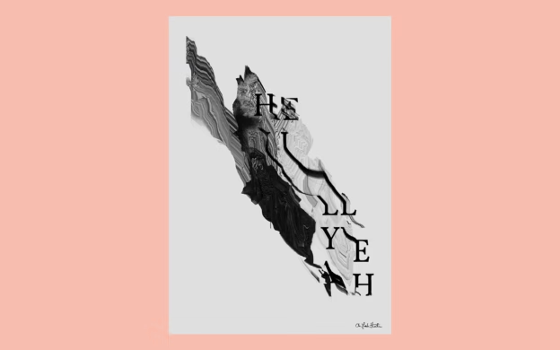
 Oh Yeah Studio
Setting themselves apart through cross-media collaborations and a mix of graphic design and hand-drawn illustration, the Norwegian Oh Yeah Studio brings art & design together perfectly. Their limited-edition “Composition 1” poster is a study of shapes and shadows that manages to be both random and calming.

 I Love My Type
Posters with longer text aren’t for everyone but we love the inspirational message and origin-story of this beloved Danish brand. The monochrome “Love The Process” poster is one of their first and, we think, still one of their best. It’s a daily reminder to draw strength from even the hardest moments in the process of life.

 Kristina Krogh Studio
Minimalist design doesn’t have to mean sparse or monochrome. Kristina Krogh’s “Levels – Beige & Copper” proves that with its color scheme, texture and visual movement. The hint of metallic foil means that it changes as the light hits it, or as you move around a room.

 Daniel Carsten
Uber-talented Swedish graphic designer & art director Carsten does a wonderful job of balancing whimsical and minimalist. His posters of paper food are both funny and visually dynamic, like this “Brunch de Ville” poster. Check out his site for a myriad of other fantastic work, including a gorgeous invite to an Acne Paper launch.

What do you have hanging in your home or office? Other graphic designs you can’t get wait frame? Tell us about them (and show us!) in the comments.
